
I've been trying to think of some other things to write about and I thought this would be interesting. Book covers are something that is very fluid! They change based on which country they are released in, special editions, even book subscriptions will publish their own books, and so on! Out of all of these different covers, there are some clear winners and losers. There are also updates that book covers will go through to try to boost their sales. Covers are the first thing any reader sees regardless of where you get your book and most of the time publishers are the ones that come up with what the cover will look like. So let's look at some books that have different covers!
Harry Potter
I feel like I needed to start this list off with the book that first comes to mind of different covers! Harry Potter has had so many different editions and a lot of them have their own unique covers! Here are the original Harry Potter covers.

These are the United States Harry Potter original covers and I love them! they are some of the most recognizable books, at least for me. I just had to get new copies of my Harry Potter series since my previous editions were so beat up from childhood wear and tear and were lucky enough to get all of these covers in hardback! They are some of my favorites, but let's look at the United Kingdom's original covers.
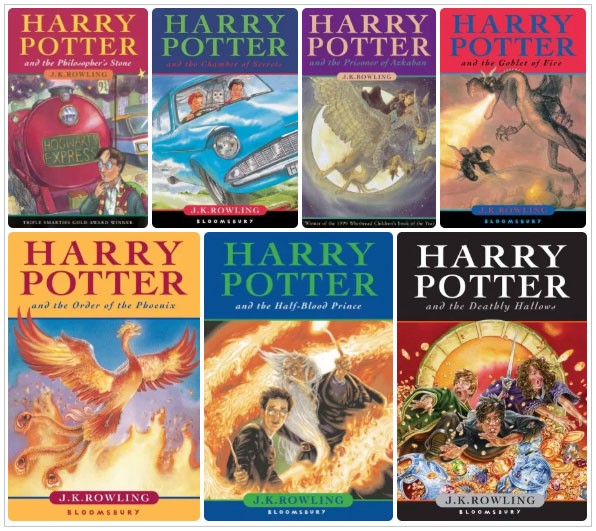
First off the first Harry Potter book in the United Kingdom was called Harry Potter and the Philosopher's Stone! This is something that happens a lot when a book is published in different countries, things are changed to make them unique to that country. The illustration on both covers look very similar and I like them both, but between these two I have to stay true to my first love the U.S. editions.
But what about the new editions. When a book has been published for so long we will get anniversary editions or books being rebranded for a new market, which is what happened with Harry Potter. They want to appeal to the new generations so new book covers were released! Here are the U.K.'s new books.

I love these new UK books! I swear you'll see as we look at the newer UK books that the covers on them are so amazing and will beat some US ones! I promise. Anyways these new sets of books are amazing and I adore them so much! I think they fit their stories so much more than their original books, both US and UK. They really pull you in and capture your attention. The only thing I would change about this picture above is to have the books in their reading order. If these books were new to me and I had to pick out of all three editions I think I would instantly be drawn to these ones! However, nostalgia has the best of me and I have still picked the OG US editions as my all-time favorite books.

Here are some honorable mentions for the Harry Potter books. I really couldn't just leave them off and they are all beautiful! There are just too many that I can't have them all in the post but we can have as many that can fit on here as possible!
Immortal Instruments
Another series that has a lot of different editions is the Immortal Instruments. Originally the United States editions had the different characters on the covers. I remember binge reading the first three in this series in a week and there is so much nostalgia there for me. However, I didn't know Clare continued on with the books, and at that time in my life, I stuck with a certain series until I finished it and had a few other series/authors that I would always get. Here are the US's original editions:
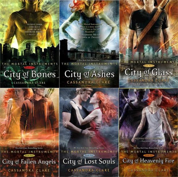
I can see why people don't like these covers. Having people on the book cover can always be problematic. But to me, I love the colors and how these covers look. I definitely like the first three more than the last three. I don't really like the last three all that much. I think they take on a completely different vibe than the first three.
The next set of books are the new covers in the United States:

They still have people on the covers and they are still colorful. Looking at these covers in this picture they look better! I love how they look in this picture. I think they showcase the characters in this series perfectly and they even have the runes underneath their titles. I think these ones stay true to the books' content. The spines on the new ones form a picture altogether and it helps motivate you to have the entire series in the same edition. The thing that I don't like about this edition is that the cover is shorter than the page and they are in paperback, this makes the cover stick out/up when you aren't reading it. If we are going off just the way it looks I think I would pick the new ones because I like them all in the whole series and the spines. But in reality, I like how the original ones look. When the books are still published today the hardcovers are published in the same original aesthetic then the paperbacks come out with this type of aesthetic. I haven't kept up with the series. I've wanted too but I just haven't gotten back to it yet.
Lunar Chronicles
The Lunar Chronicles is something that I binge read when they came out. I loved this so much! The series are fairytale retellings that take on a new life throughout these books. I really want to do a reread since I finally got them in physical form! Anyways the original covers look like this:

I find these covers gorgeous! To me, they are very simplistic and they all really match one another (except Fairest). Each of them really speaks to which fairytale it is a retelling and I just really love them! Even Fairest I get why it stands out and it makes sense if you have read the series you'll get it too.
Here are the new covers that are coming out in the United States, this is a rebranding:

Guys when I first saw these editions I thought they were going to be comic series and they work for a comic version of this series. But it isn't. These are the new book covers for the same stories. I don't think they fit the books they are representing and they don't match like they did. I like for my series to match one another and I know a lot of other readers do too. I usually like these poppy, bright colors but of course, no this just doesn't work for me. These are just so depressing to me.
Skyward - US vs UK
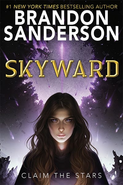

(US on the left and UK on the right)
I think Skyward is the first book that I really started seeing that the United Kingdom book covers are really stepping up their game and are looking amazing! I always knew that different countries have different book covers that are unique to them but for a long time the UK editions were more cartoony like the Harry Potter ones for example. But these new ones are amazing. The United States edition is pretty colors I'll give them that, but the UK edition is so much more dramatic and I think really pulls you in and make you want to pick it up. Now I personally have the US edition because I just picked it up while I was the book store on one of my sprees.
Nicholas Sparks Books
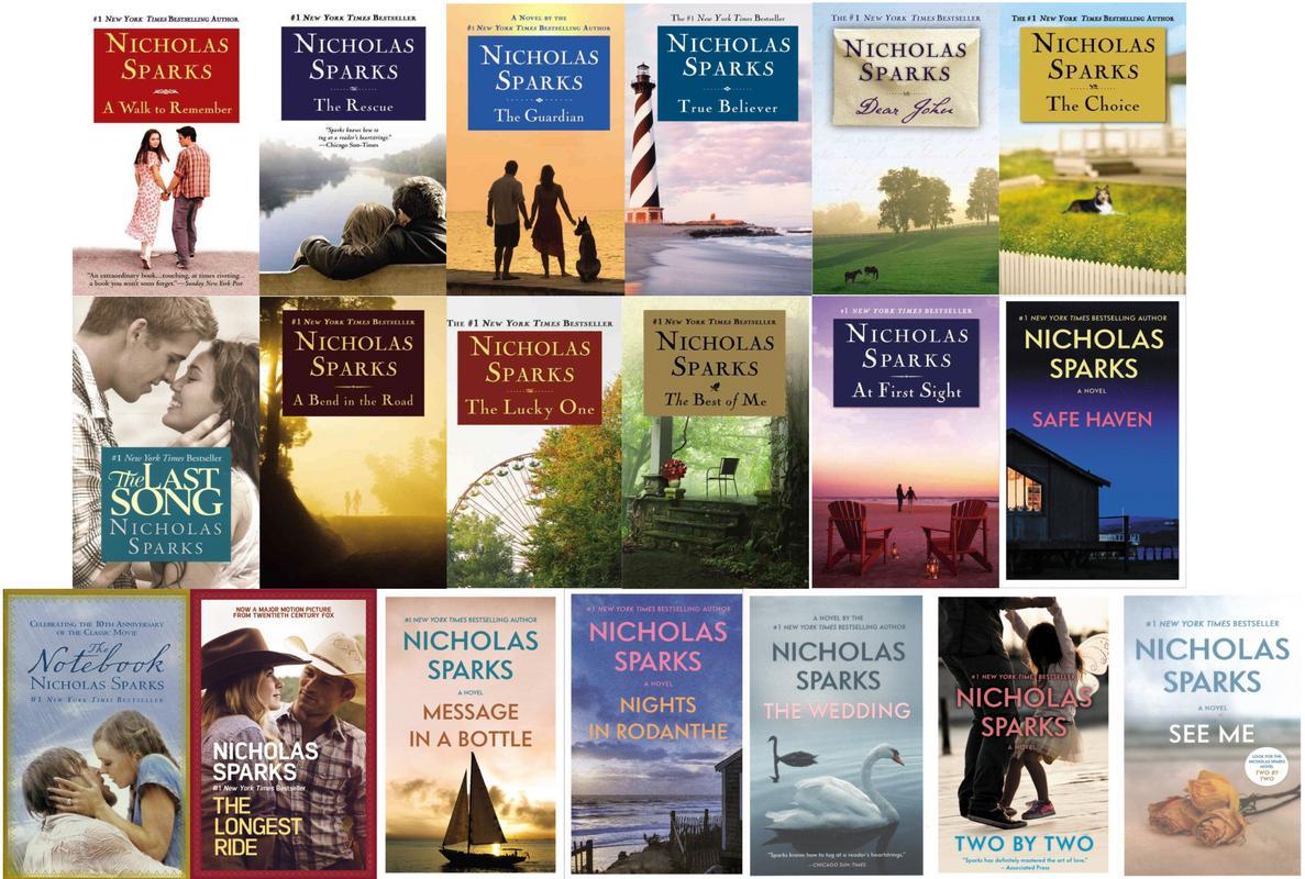
Okay, so the above picture showcases all styles of Sparks books. I love the way the originals look that doesn't have people in them, which the first row of books is all original covers. The second and third rows show how all of the movies that Spark's books are adapted from get movie covers. Movie covers are usually some form of posters from the movie that is based on the book. I usually try to stay away from them since I personally just like to have the original covers. Then the last set of books on the third row showcases what the new covers look like. These ones aren't bad and I normally like the pictures that are on the book themselves. I even like how they all match each other. On these covers, you can see how they all have a white border. the new covers are bordered, and like I said I would love these covers if the rest of my Sparks books had them too. Slowly the older books are being reprinted to have the same format and being rebranded this way. This isn't a terrible rebranding, and the new books are matching this format. I just hate that they don't match what I already have. But that is just my pet peeve. I have an assortment of all three of these styles but I have even gotten rid of some of the covers that I don't like in trade for ones that I have. I've been slowly rebuilding my Sparks collection. Just like Patterson, I have a love/hate relationship with Sparks writing but I think with this one it is more so since with these books I either love them or I really despise them. Yet I can't tell until I finish the book and his books are always chunkers and super long chapters. Where I've been doing movie vs book challenges lately I've been dying to do a reread of some of his books because I know most of the books always hands down beats the movies since the movie adaptations are always really rough. The only movie that I think beats the book for Sparks is the one that we all know and love, which is the Notebook.
Mass Market Copies

Mass market books are paperback books that are usually kind of on the tiny side, with tiny print, and usually really cheap. These copies can be as cheap as a couple of dollars, and usually, the most expensive ones are like $5. Do I love these versions? No, but I still have a ton of them. I usually don't care if these ones get messed up while I'm reading them so I love reading them in the summer by the lake. But at the same time, one of the most coveted series I have mostly in mass-market editions because they are part of an older series and these are the only editions I can find. Sometimes these are the paperback versions of the book, which is my case in my series, the In Death by JD Robb. Anyways, a lot of books can be made into mass-market and usually happens after they have been out a little while. Everyone has their own opinions about these books.
No comments:
Post a Comment